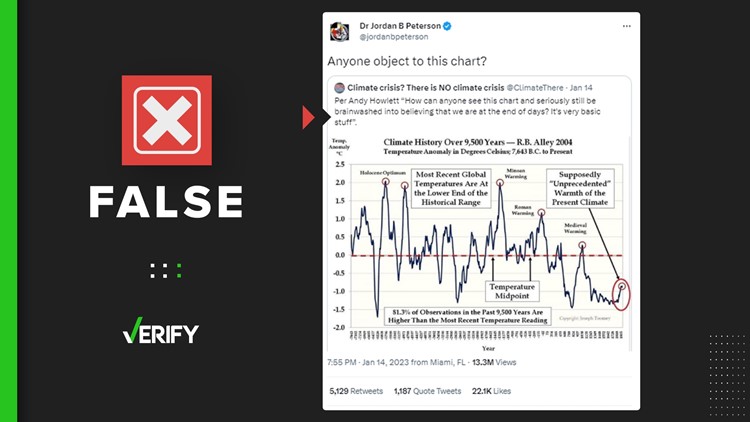
A graph arguing that our current climate isn’t in a period of “unprecedented warmth” went viral when it was retweeted by Jordan Peterson, a controversial psychologist and author, to his 3.7 million Twitter followers. The graph claims that recent global temperatures were below the average of the last 9,500 years.
The graph shows spikes and drops in temperature over the past 9,500 years, charting how much higher or lower each year’s temperatures are than the average temperature over the entire time period. While Romans lived during a peak in temperatures, the graph claims, our “present climate” is below the 9,500-year average.
THE QUESTION
Does this graph show current global temperatures are below the average of the last 9,500 years?
THE SOURCES
- GISP2 ice core dataset from Richard Alley, Ph.D.
- Richard Alley, Ph.D., a glaciologist and climate scientist at Penn State University
- National Oceanic and Atmospheric Administration (NOAA)
- NASA
- Studies estimating global temperature over past 10,000+ years from 2013, 2020 and 2021
THE ANSWER
No, this graph does not show current global temperatures are below the average of the last 9,500 years.
WHAT WE FOUND
The graph is misleading for two reasons.
First, the graph doesn't include data measurements for the last century and a half, which means it misses the current period of global warming entirely.
Second, the temperature measurements it uses are for central Greenland, not global averages.
VERIFY spoke to the scientist cited as the source of data in this graph, “R.B. Alley,” or Richard Alley, a glaciologist and climate scientist at Penn State University. The 2004 dataset it refers to is Alley’s “GISP2 Ice Core Temperature and Accumulation Data,” which is a set of temperature estimates for the past 40,000 years measured from an ice sheet in central Greenland.
In an email to VERIFY, Alley confirmed that this graph is not an accurate interpretation of his data, which specifically measures Greenland’s temperatures. He also said historical warm periods don’t disprove climate change.
“The existence of warmer times in the past does not cast doubt on the human cause of the ongoing warming or on the dangers of that warming,” Alley said.
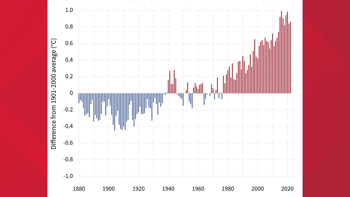
His data includes no measurements of present temperatures. The most recent year it covers is 1855, 30 years earlier than what’s presented on the graph. The global temperature now is vastly different from what it was in the 1800s.


Greenland’s own modern-day temperature observations are a good example of how different today’s temperatures are from those in 1855. The ice core Alley used for his temperature measurements is from Summit Station, Greenland. In 2021, when converting Celsius to Fahrenheit, Summit Station’s average temperature was about -19.9 degrees Fahrenheit, according to data from NOAA. That’s 5 degrees warmer than Alley’s 1855 temperature, which was -24.9 degrees Fahrenheit.
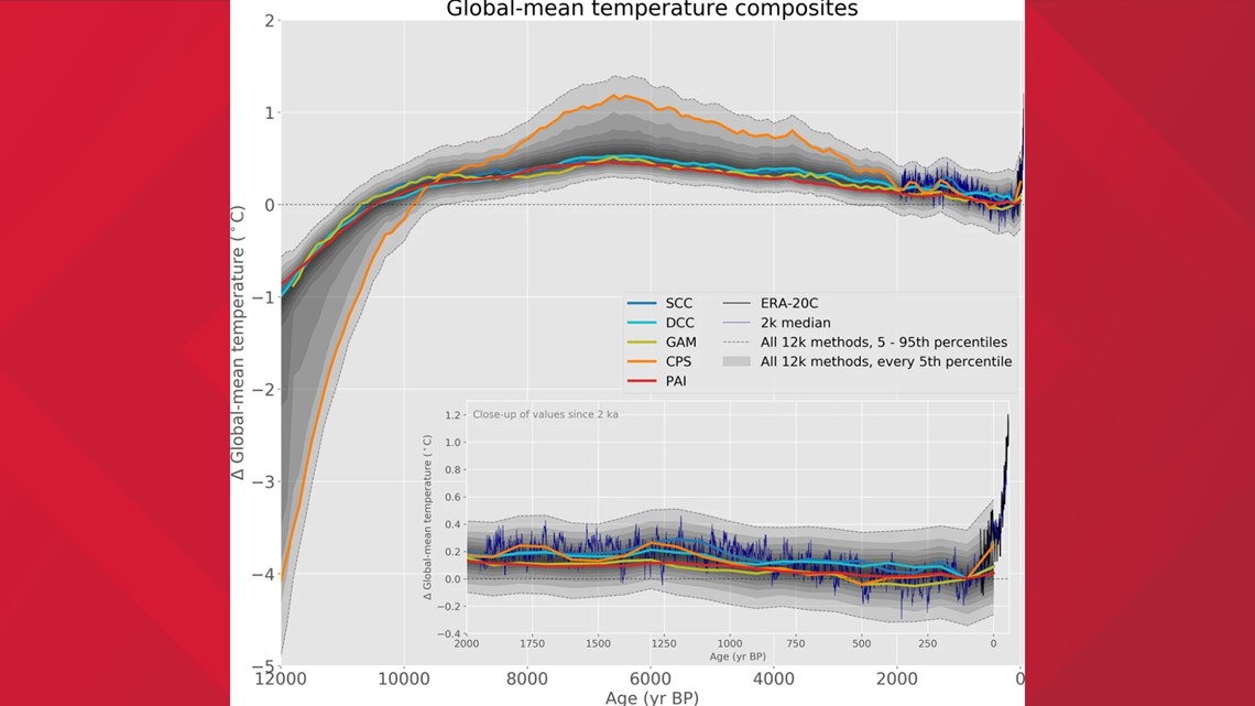
Many other studies comparing today’s global temperatures to the average of the past 10,000 years consistently find that the Earth is currently warmer now than it has been for most of that time span. For example, the chart below from a 2020 study shows today’s temperatures are as high as the hottest temperatures across five different estimates of temperatures over the past 12,000 years.


